Product · Fintech
Stori Cuenta+
Savings and investment product launched by Stori — from zero to market in 15 months leading a 50+ person team.
The mission was to expand Stori beyond credit: help users do more with their money. I started the project with one teammate. Fifteen months later, we had taken it to production with a team of 50+ people.
I was the transversal product and design lead, working together with other great product leads, designers, and engineers on: user research, persona definition, value proposition, product architecture, wireframes, flows, visual identity, prototypes, usability testing, compliance strategy, and go-to-market rollout.
Every deliverable coordinated across product, design, engineering, marketing, compliance, and legal — maintaining coherence without losing speed.
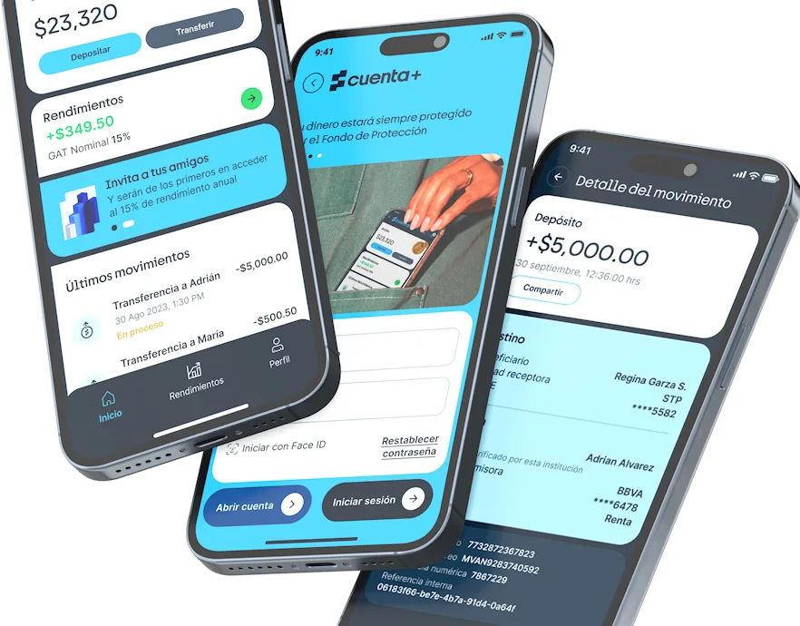
Splash screen
I designed and animated the splash screen that introduced Cuenta+ to users for the first time. The animation builds on the concept of 'más' — guiding users through a narrative that leads from the Stori brand into the deposits product. The sequence lands on the general login, where selecting the deposits option transitions into the Cuenta+ experience. I created the animation in After Effects and exported it as a JSON file, allowing it to be implemented as a Lottie animation — keeping the file size minimal while running natively on both Android and iOS with full fidelity.
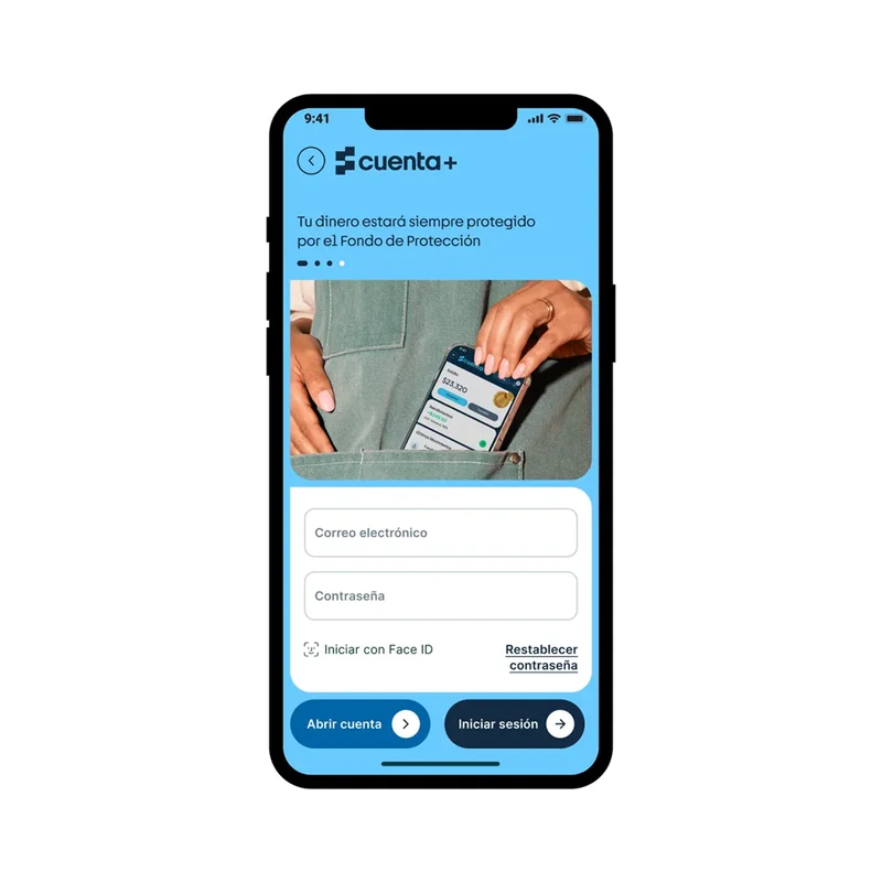
Login & onboarding
Stori was transitioning from a SOFOM to a SOFIPO — a regulatory shift that required the deposits product to be clearly differentiated from the core Stori credit card.
Brand differentiation — We chose a dedicated blue color palette, extending DeLorean (the design system I led), to create immediate visual separation from the orange Stori credit card. The blue semantic tokens signaled a distinct product identity while maintaining brand coherence.
Value proposition first — The login opens with a carousel showcasing product imagery and the core value prop (15% APY, no lock-in, daily yields). This was intentional: users needed to understand what Cuenta+ was before creating an account, reducing drop-off in the sign-up funnel.
Frictionless access — Sign-in supports email/password and Face ID. The biometric option was critical for a financial product — users check balances frequently, and every second of friction compounds into lower engagement.
Design system validation — This was the first product to fully implement DeLorean, with its distinctive art direction: rounded corners mixed with straight edges, subtle strokes, and semantic color tokens. It proved the system could scale beyond the credit card.
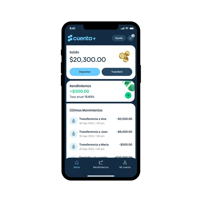
Home screen
The home screen was designed around one question: how do we make users deposit more and keep their money longer?
Balance as hero — The user's balance sits at the top with a 3D coin illustration, making their money feel tangible and present. This was a deliberate psychological choice — seeing your balance grow reinforces the behavior of depositing.
Intentional CTA hierarchy — The primary action 'Depositar' uses a contrasting light blue that stands out from the dark UI. Transfers are secondary. This prioritization wasn't arbitrary: higher balances = higher AUM = stronger unit economics. The user benefit aligned perfectly — more deposits meant more yields.
Yields card as retention hook — Below the balance, a card highlights the 15% APY with daily accrual and no lock-in period — a differentiator unique in the Mexican market. This card existed to answer the question users always have: 'is my money actually growing?'
Transaction history — Each movement shows title, timestamp, and amount using a consistent component pattern. Transparency in every transaction builds the trust that a new fintech product desperately needs.
Navigation model — A bottom nav with three tabs (Home, Rendimientos, Mi cuenta) keeps the experience focused. We intentionally limited the navigation to avoid feature bloat in V1.
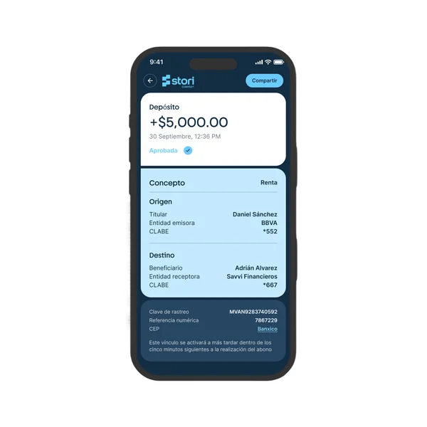
Transaction detail
Every deposit and transfer needed to communicate its status instantly and clearly — approved, rejected, or pending.
Amount & status — The transferred amount is the hero element, displayed prominently with the date, time, and a clear status indicator. Users know immediately whether their money moved.
Transaction breakdown — Below the amount, a detail card shows the concept, origin, and destination of the movement. This transparency was essential for a new financial product — users needed to verify every detail.
Regulatory information — A dedicated section displays the regulatory data required for each transaction, ensuring compliance without cluttering the primary view.
Share as primary CTA — The main action is sharing the transaction confirmation via image, PDF, or message. This serves both practical needs (proof of payment) and organic growth (recipients discover Cuenta+).
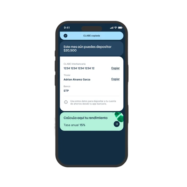
Account details & deposits
Deposits into Cuenta+ require a bank transfer — there's no other method. The design needed to make this process as frictionless as possible.
CLABE front and center — The interbank key (CLABE) is the primary element, displayed on a white card with direct copy-to-clipboard buttons. One tap copies the key, ready to paste into any banking app or share via message.
Deposit limit indicator — Above the CLABE, a progress bar shows how much the user can still deposit this month. Due to regulatory requirements, these accounts have a monthly limit tied to UDIs (~1,000 MXN). Making this visible prevents failed deposits and frustrated users.
Yield calculator as incentive — Below the account details, an embedded yield calculator shows projected returns based on deposit amounts. In the empty state of the account, this calculator appears prominently — motivating users to make their first deposit by showing exactly how much their money would earn.
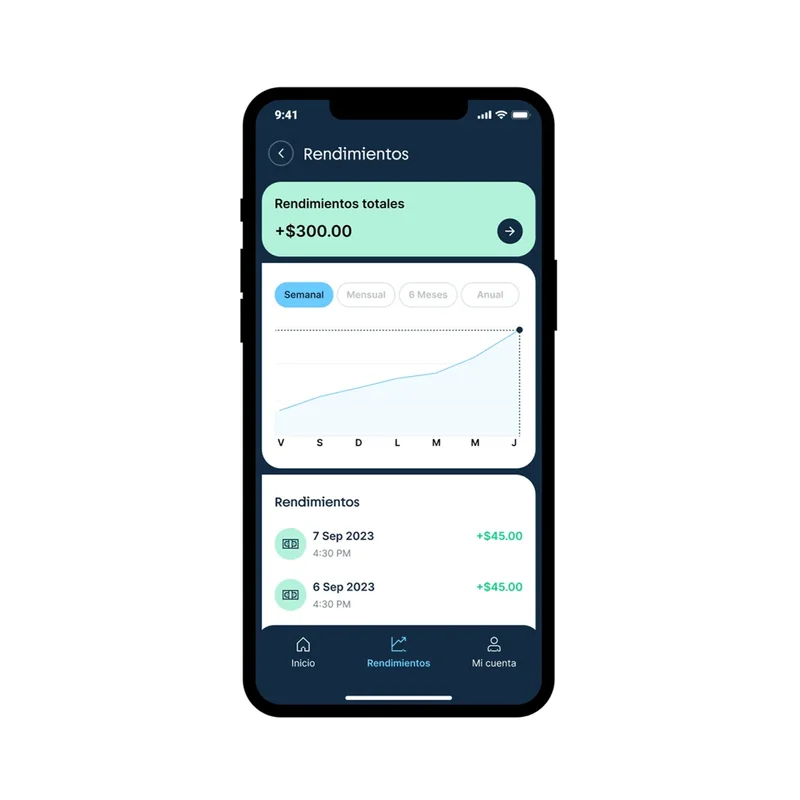
Yields (Rendimientos)
This screen had one job: make yields feel real, not abstract.
Total yield prominence — The accumulated yield is displayed at the top in a green card, making it the first thing users see. Green was chosen deliberately — it signals growth, gain, and positive momentum.
Interactive chart — Below, users can switch between weekly, monthly, 6-month, and annual views to see their yield trajectory. This visualization was critical for retention: seeing an upward curve makes users feel their money is working. During usability testing, this was the feature users spent the most time exploring.
Daily yield breakdown — A detailed list shows each day's accrued yield with date, time, and exact amount. This level of granularity serves two purposes: it builds trust (users can verify the 15% APY is real) and it creates a habit loop (checking daily yields becomes a rewarding routine).
Metric impact — This screen directly contributed to early retention. Users who engaged with the yields view regularly showed significantly higher retention rates, validating the design decision to make yields tangible and visible.
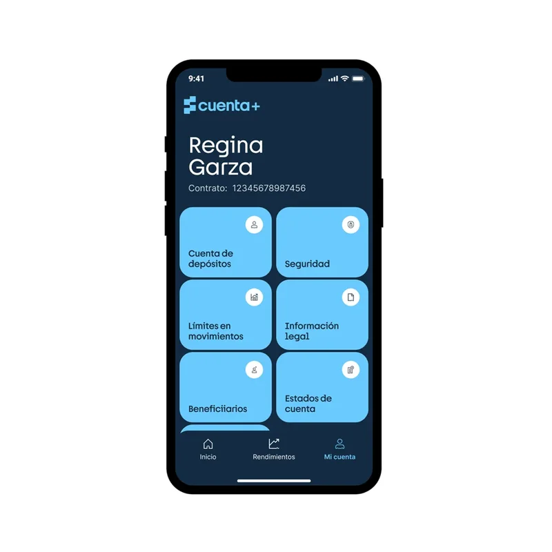
Profile
The profile screen was designed to feel like a control center, not a settings page.
Card-based navigation — Instead of a standard list of settings items, each action (Cuenta de depósitos, Seguridad, Límites, Información legal, Beneficiarios, Estados de cuenta) is presented as a tappable card with an icon. This gives each option more visual weight, larger tap targets, and a more premium feel consistent with Cuenta+'s positioning.
Regulatory compliance by design — Several cards exist because of SOFIPO requirements: beneficiary management, legal information, and account statements are mandatory. Rather than burying them in sub-menus, we made them first-class citizens. This significantly reduced support tickets from users asking where to find their statements.
Contract number visibility — The contract number is displayed below the user's name, always accessible. For a regulated financial product, users frequently need this for transfers and support — hiding it would create unnecessary friction.
Visual consistency — The card grid follows DeLorean's layout tokens, ensuring the spacing, radius, and color treatment match the rest of the experience. The blue cards on dark background maintain the Cuenta+ identity established in login.
National launch video
To launch Stori Cuenta+ nationally, I led the end-to-end production of the launch video — from storytelling and art direction to animation and graphic design. The video communicated the product's value proposition for the first time: what Cuenta+ is, how it works (step by step), and why it matters. It was designed to position the brand, build trust with a new audience, and drive downloads at scale.