Product Design · Design System
Marshmallow 4.0
talabat's design system powering high-quality, brand-consistent interfaces across all products in the MENA region.
talabat serves millions of users across the MENA region — every screen, every flow, every interaction needs to feel like one product. Marshmallow is talabat's foundational design system: a cross-platform library of components, tokens, and foundations that enables squads to build consistent, high-quality interfaces at scale.
I grew the team from a small Product Design unit into DesignX, a cross-functional team spanning Product, Design, and Engineering. The system evolved from primitive tokens to a full semantic architecture supporting multi-brand theming, dark mode, campaign theming, and Pro theming — shipping across Figma, Flutter, Fluid (our in-house SDUI), and GoLang/C# backend SDKs.
By 2026, DesignX became the intelligent design engine of talabat — every PM, designer, and engineer relies on Marshmallow, Marsh (our AI agent), and Fluid to produce the best experiences, generate specs, and hand off full-stack code-ready outputs. None of this would have been possible without the incredible team behind it: Alaa, Amogh, Billy, Vince, Gaby, Yasin, Slava, Almasri, Momo, Lucas, and Luis.
Due to confidentiality, the level of detail in this case study is limited.
Impact
Marshmallow 4.0 is used by every product squad across talabat's Product & Technology organization. The semantic token architecture enabled dark mode, Pro theming, and campaign theming without breaking a single component. The system reduced design cycle time, eliminated redundant UI rebuilds across squads, and became the foundation for AI-driven workflows through Marsh — compressing the path from concept to production.
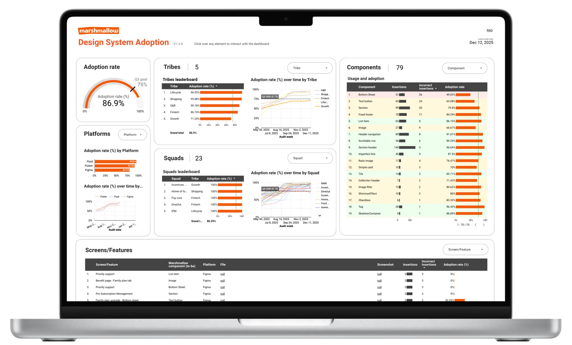
86.9%
Adoption rate
32%
Cycle time reduction
99.3%
Cross-stack availability
2nd
Global UI Excellence
across Delivery Hero
2
Days to production
23+
Squads collaborating
Atomic Design Principles
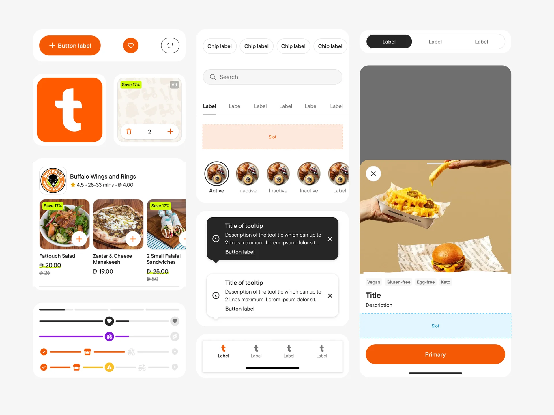
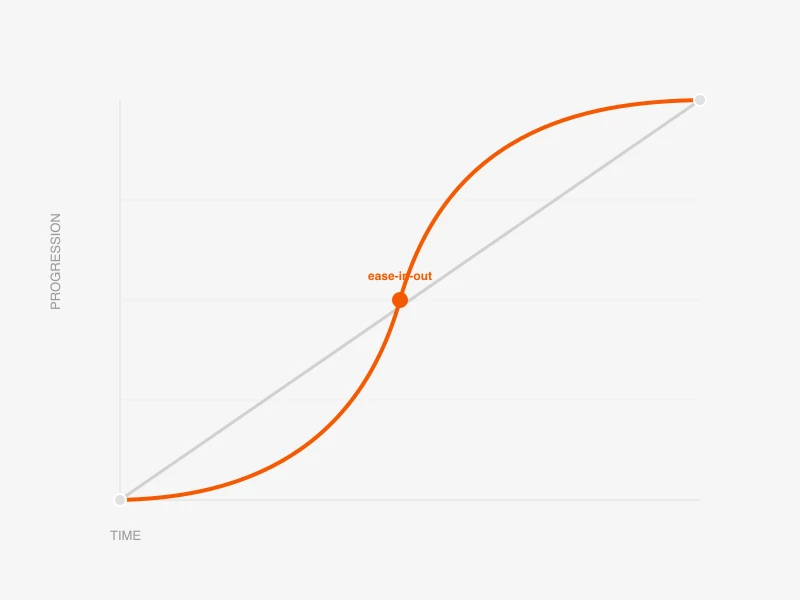
Marshmallow is built on atomic design — a modular approach that breaks interfaces into reusable pieces, from design tokens and atoms to molecules, organisms, templates, and full pages. This structure makes every layer of the system clear, composable, and connected.
Foundations
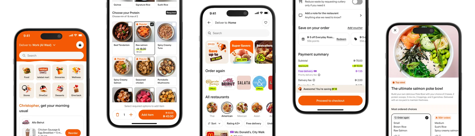
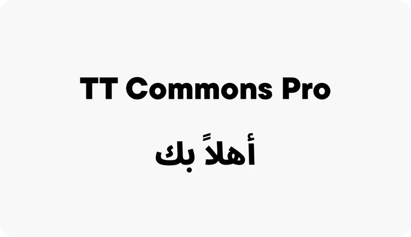
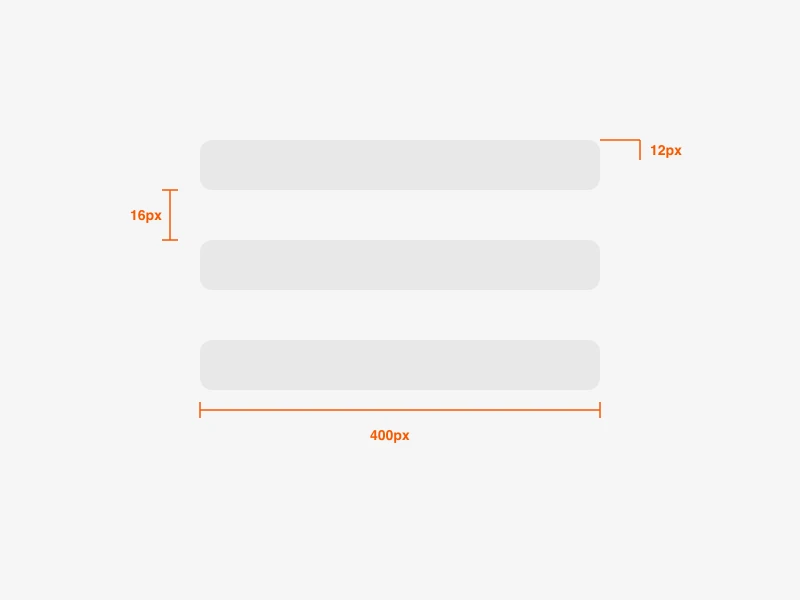
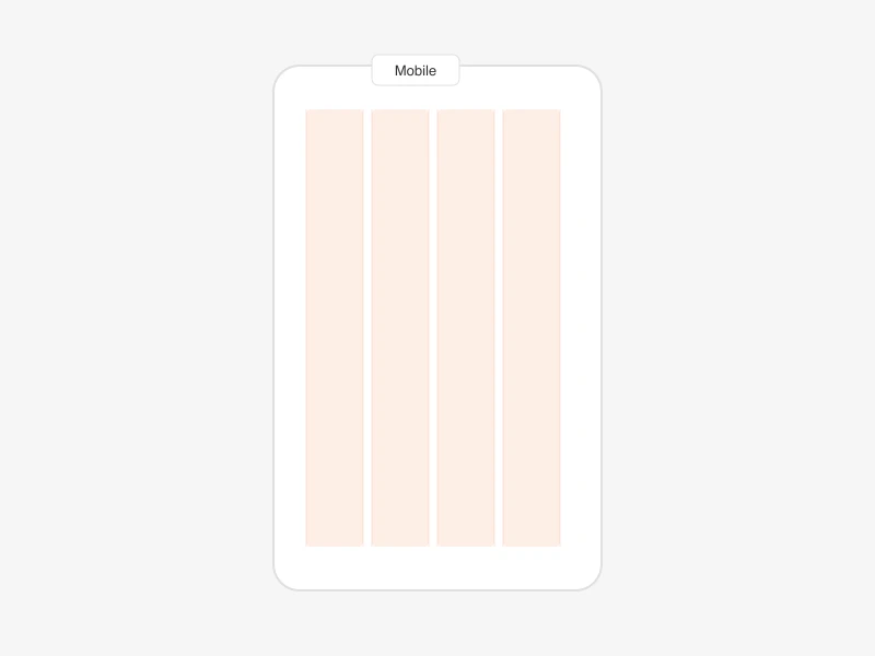
Marshmallow 4.0 provides the building blocks for every interface at talabat — from color and typography to icons and layout systems. These foundations ensure visual consistency from the smallest icon to full-page compositions across all platforms.
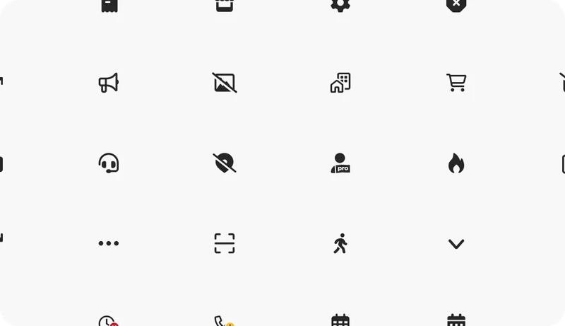
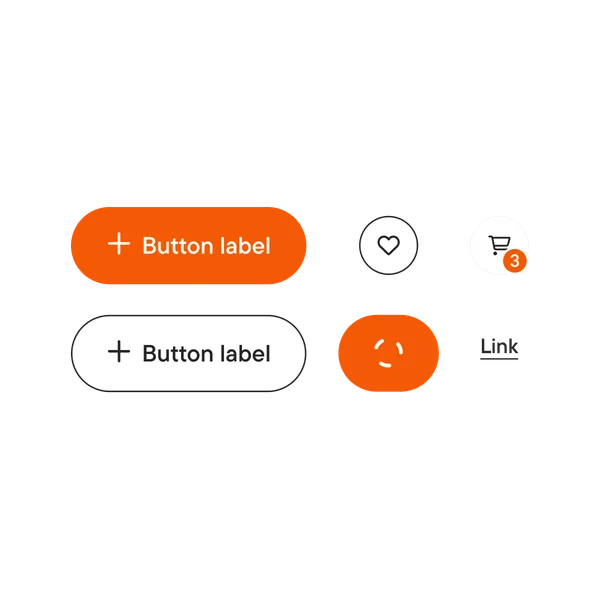
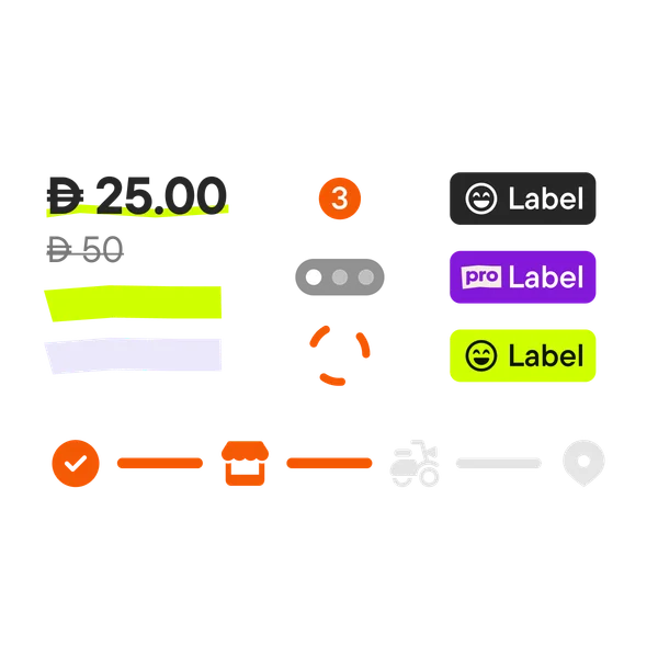
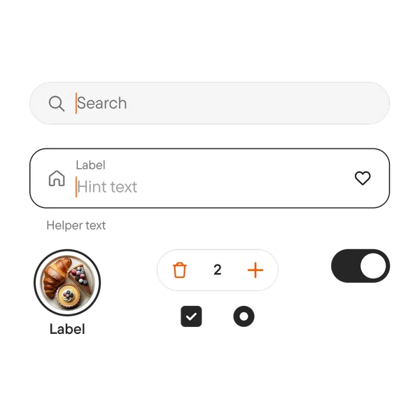
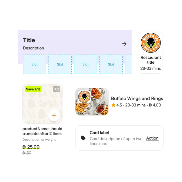
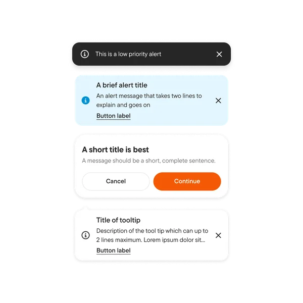
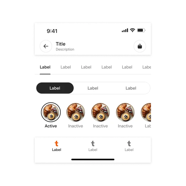
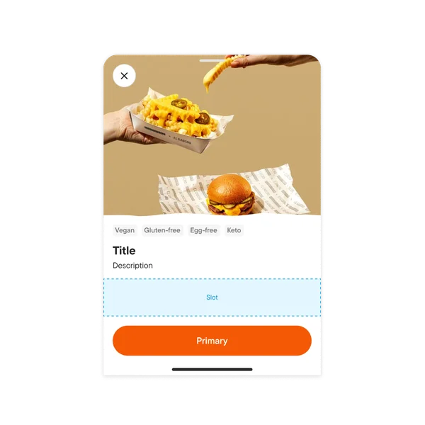
Component library
A comprehensive library of production-ready components organized by function — from basic inputs to complex compositions. Every component supports semantic theming, is fully responsive, and ships across Figma, Flutter, Fluid, and backend SDKs.
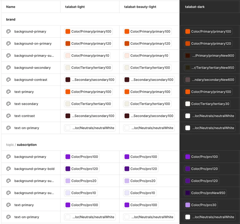
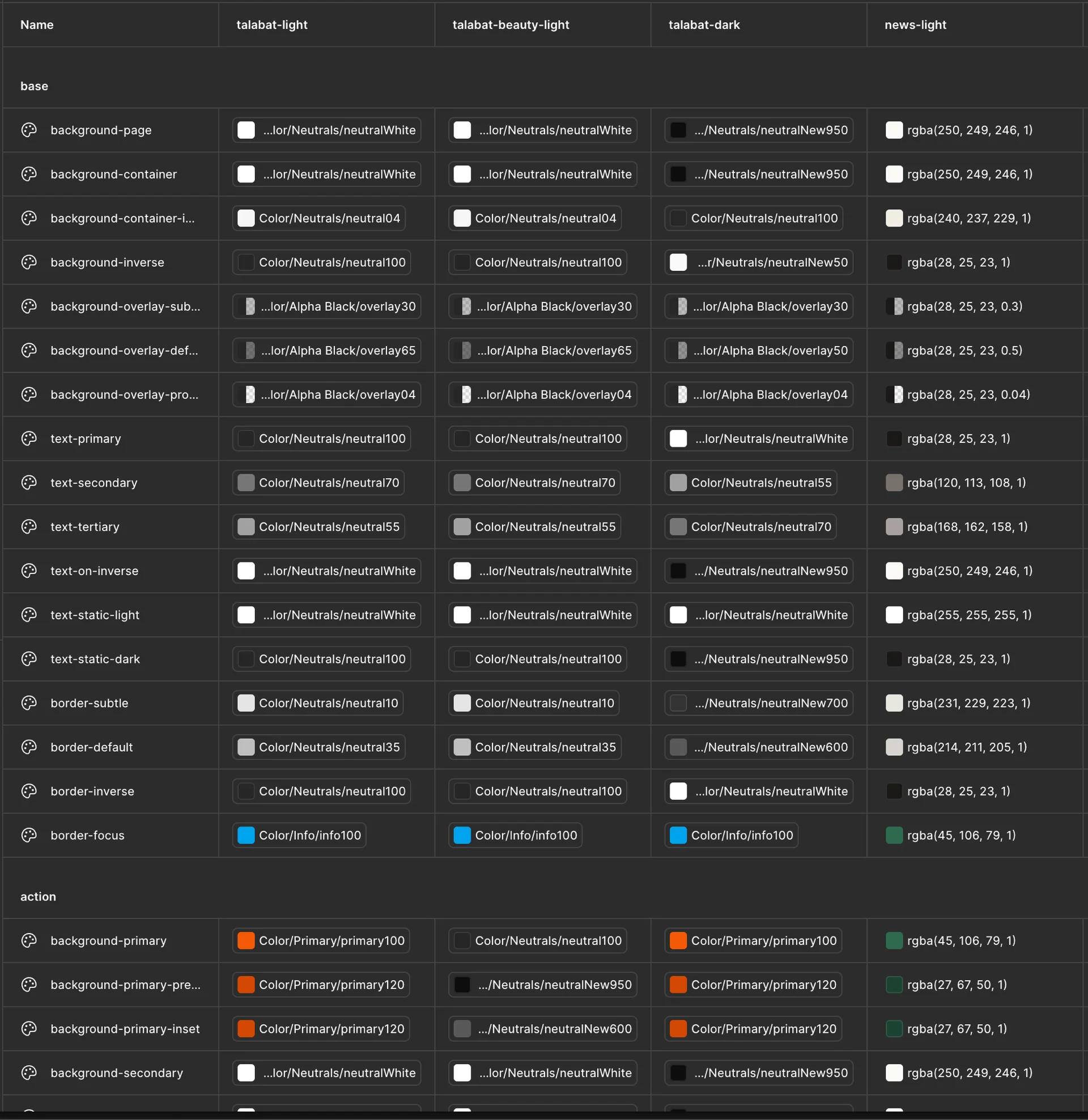
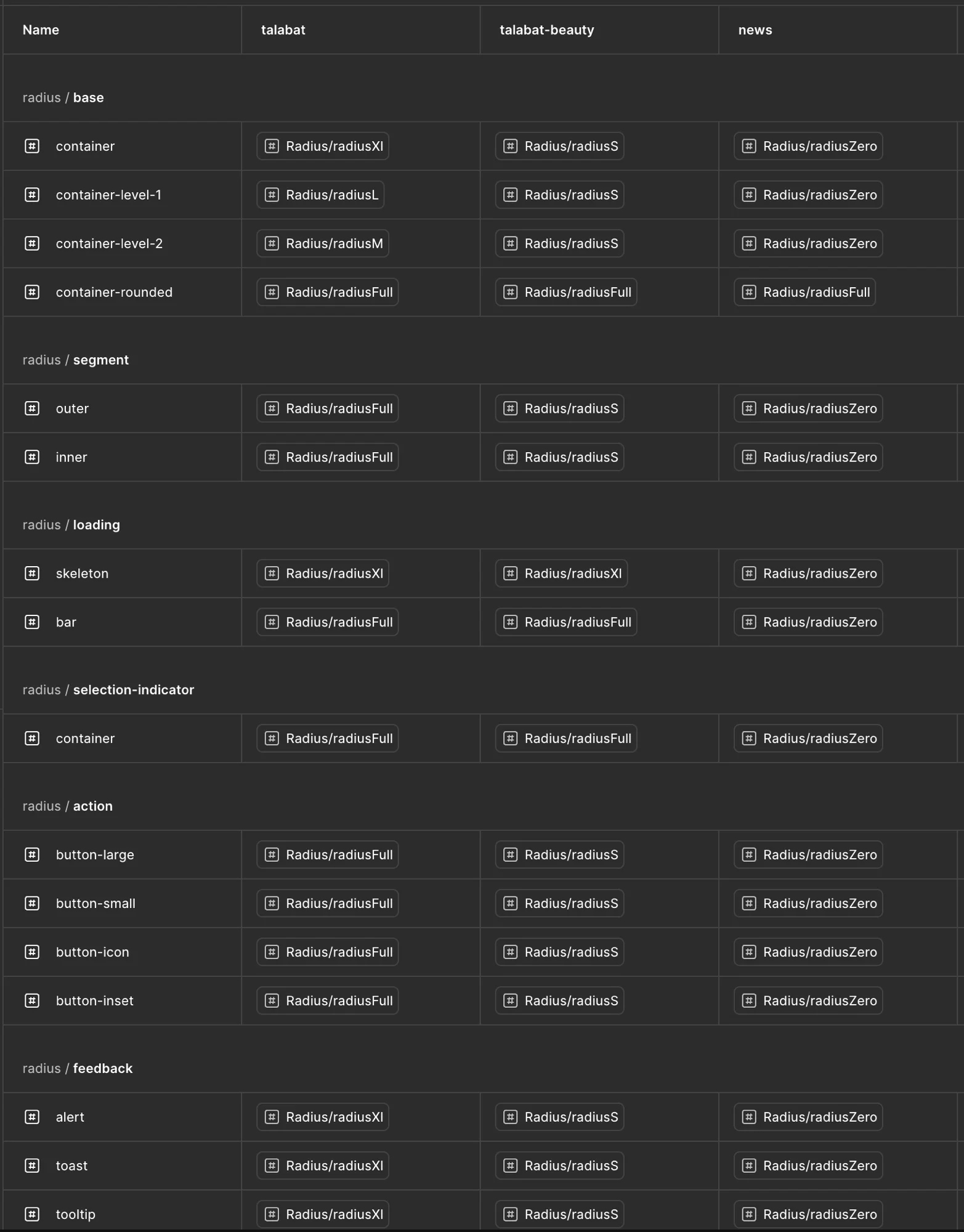
Semantic tokens & theming
The migration from primitive to semantic tokens was the architectural shift that unlocked everything — dark mode, Pro theming, campaign theming, and multi-brand support. Primitive tokens describe what a value is (colorNeutralWhite). Semantic tokens describe how and where it's used (baseBackgroundPage). This means we can change the entire app's appearance by swapping a theme, not rewriting code.
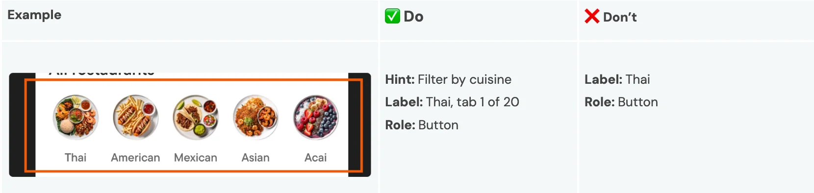
Accessibility for visually impaired users
We automated semantic labels across all Marshmallow components so that VoiceOver and screen readers can accurately describe every interactive element. Each component ships with structured hints, labels, and roles — enabling visually impaired users to navigate the full talabat experience independently.
Adoption & governance
Adoption isn't optional — it's observable. We built a DS adoption dashboard with automated weekly CI audits tracking component usage and token migration across every squad. Static analysis checks warn or block PRs using deprecated tokens, and an ambassadors program embeds design system designers with specific tribes. The result: measurable design excellence, not anecdotal feedback.