Product · Systems
DeLorean Design System
Stori's foundational design system enabling consistent, high-value products across Latin America.
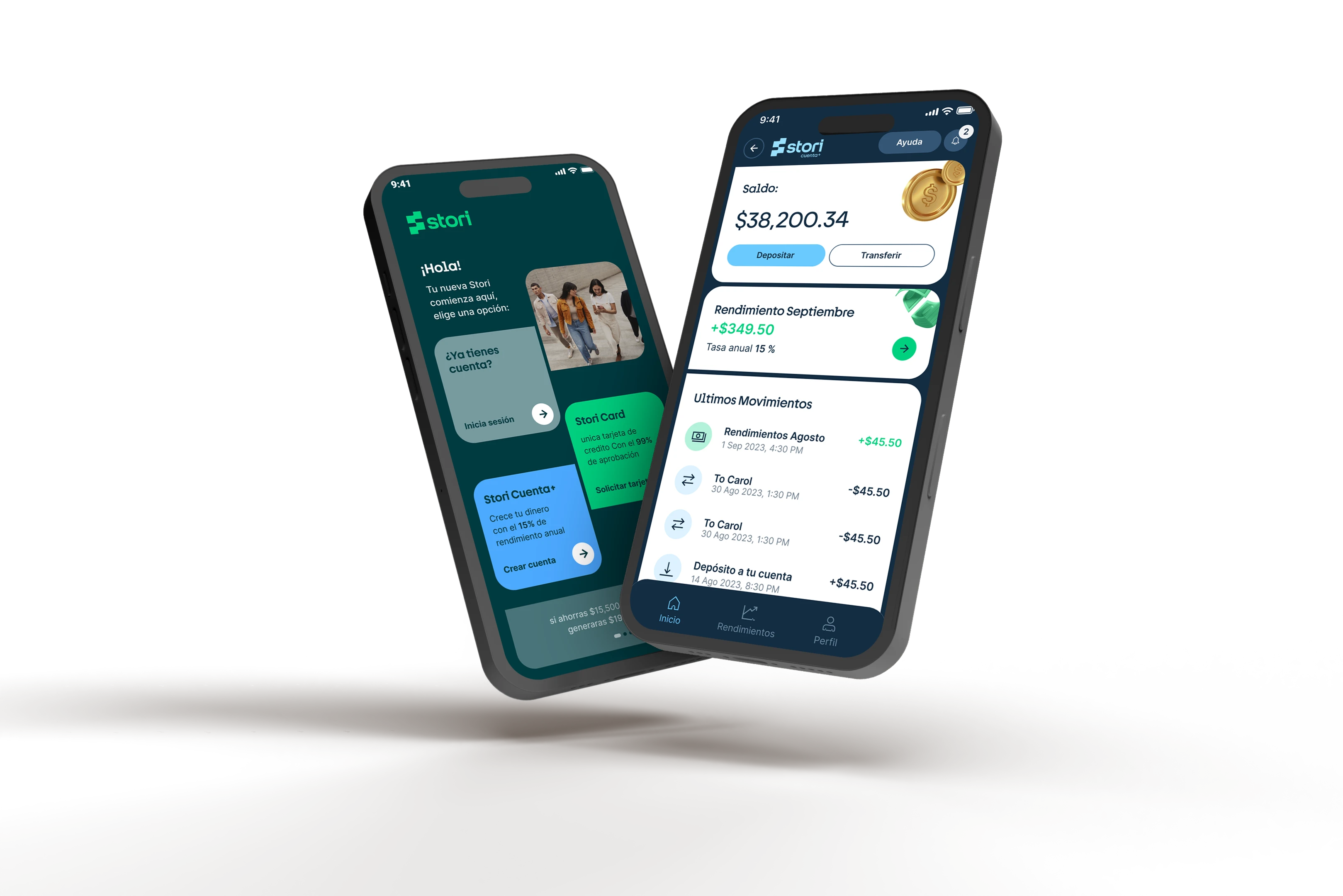
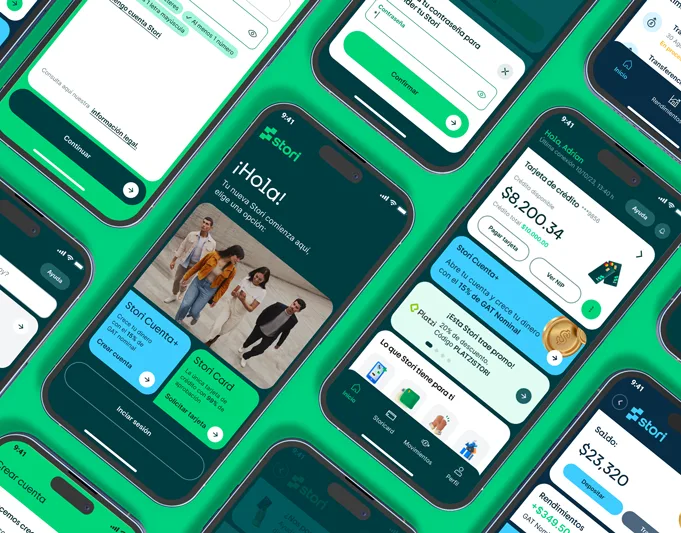
Stori needed to scale across multiple countries with consistent, high-value products. The answer was DeLorean: a design system built on atomic design principles, unifying iOS, Android, and Web under a single visual language.
I led the project from inception — growing the team to include dedicated designers and engineers, creating the design system logo, and building the component architecture across all platforms. The system shipped with Supernova-powered documentation as the single source of truth, with platform-specific guides for Android, iOS, and Web (Storybook).
The result was Stori's first official design system: 100+ components shipped to production and a 32% reduction in design cycle time.
Due to confidentiality, the level of detail in this case study is limited.
Impact
DeLorean became Stori's first official design system, unifying iOS, Android, and Web under a single visual language. Broad adoption across every product squad accelerated delivery and raised baseline quality across the entire product surface.
+90%
Adoption rate
32%
Reduction in cycle time
1st
Design system of the company
100+
Components
Atomic Design Principles
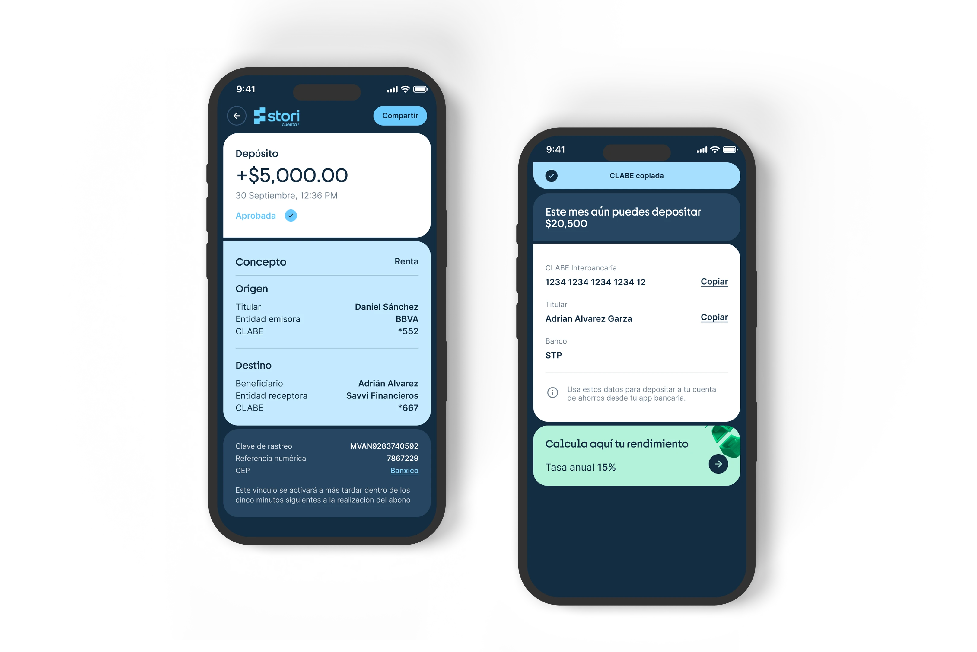
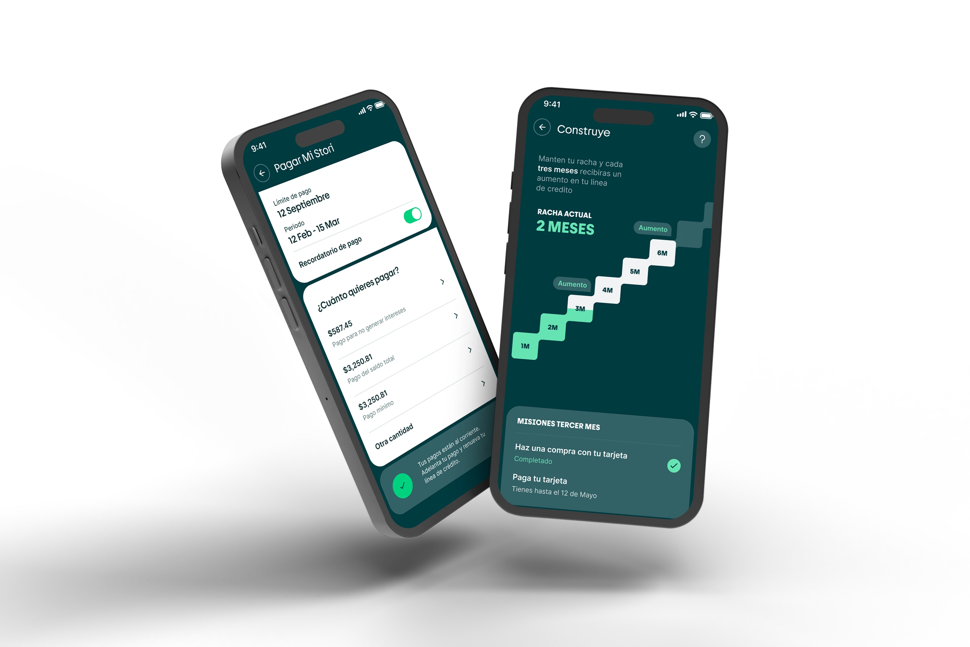
DeLorean is built on atomic design — a modular approach that breaks interfaces into reusable pieces, from design tokens and atoms to molecules, organisms, templates, and full pages. This structure makes every layer of the system clear, composable, and connected across iOS, Android, and Web.
Foundations
DeLorean provides the building blocks for every interface at Stori — from brand elements and color to typography, spacing, and iconography. These foundations ensure visual consistency from the smallest icon to full-page compositions across iOS, Android, and Web.
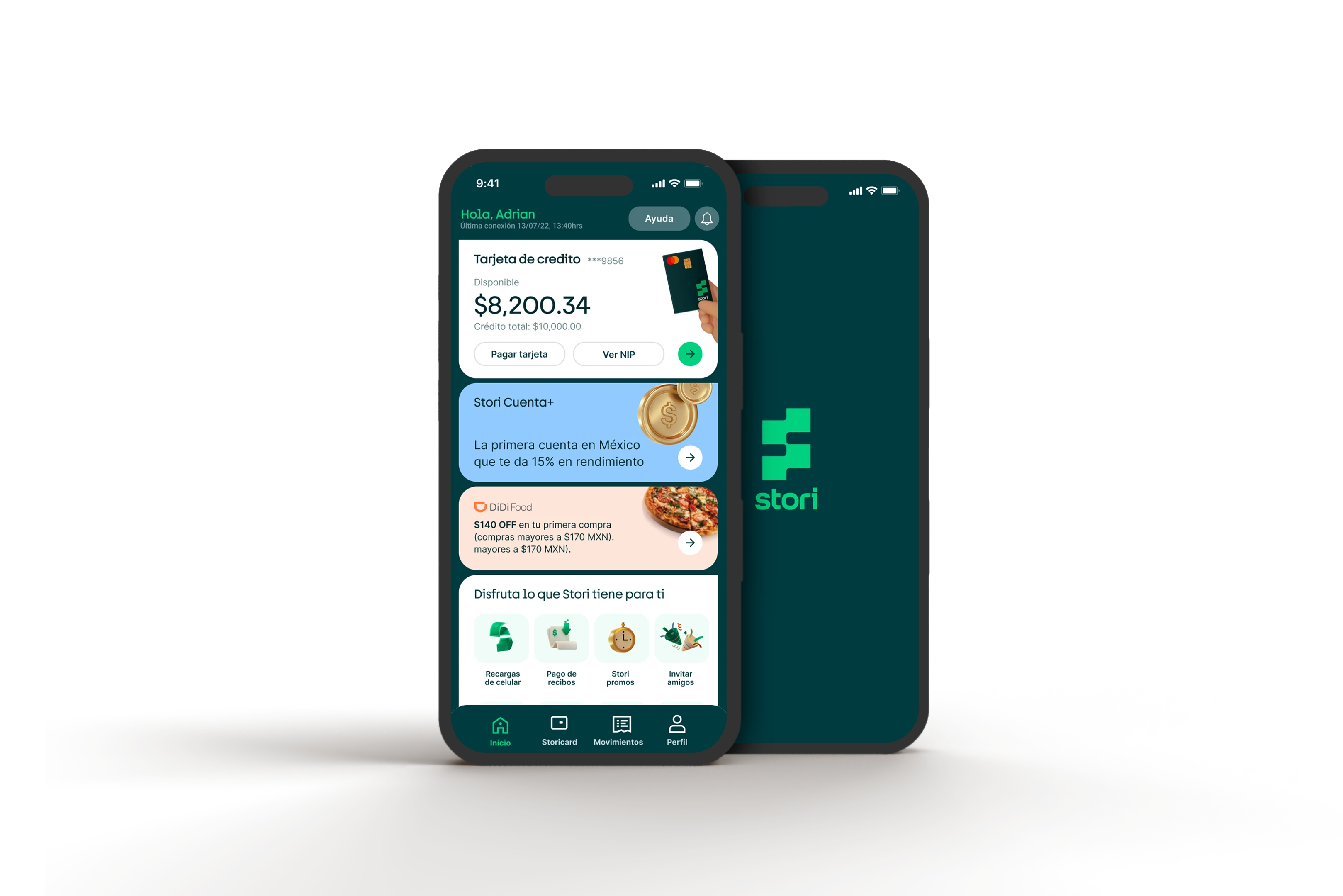
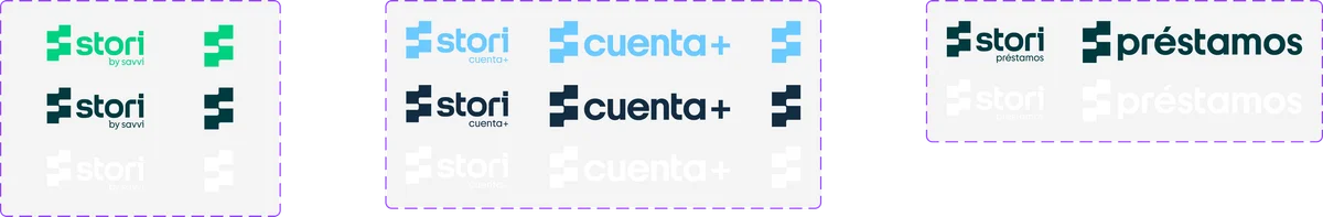
Brand elements
Three primary logos in their respective responsive versions: the Stori logo, Stori Cuenta+ logo, and Stori Préstamos logo — each adapting across contexts while maintaining brand coherence.
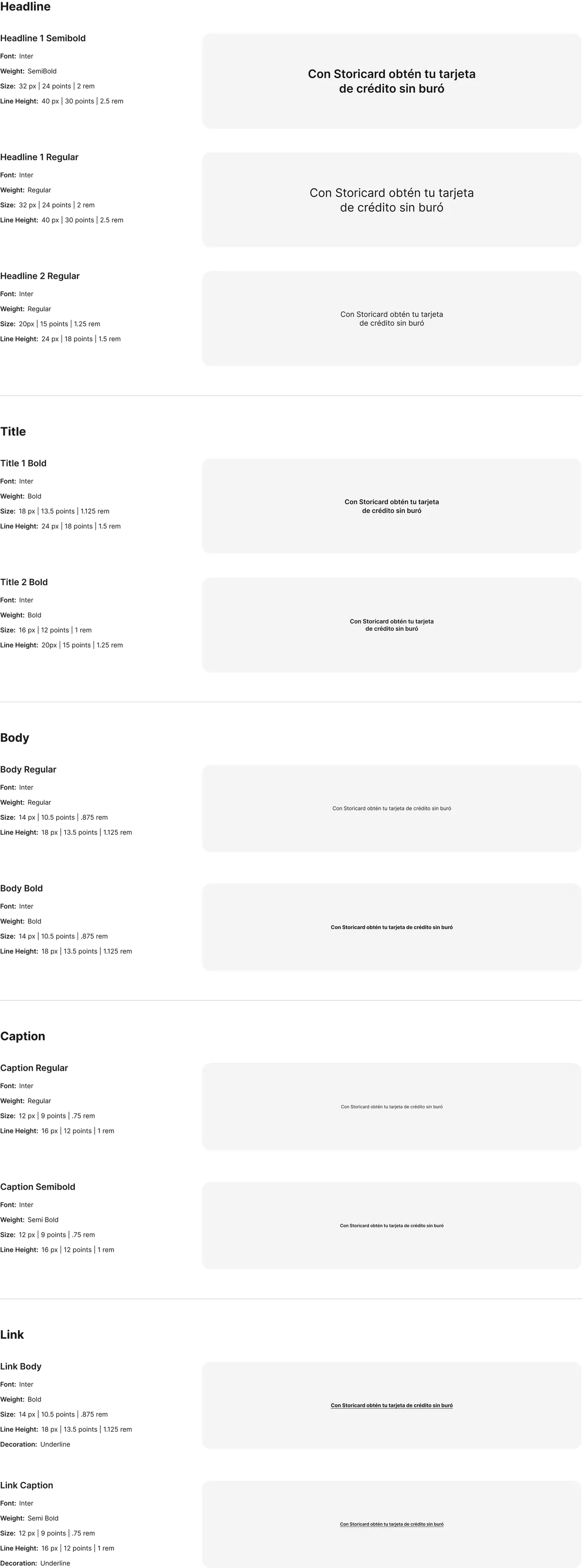
Typography
Five typographic hierarchy levels — Headlines, Titles, Body, Caption, and Link — all using Inter in different weights and sizes, following accessibility principles for readability.
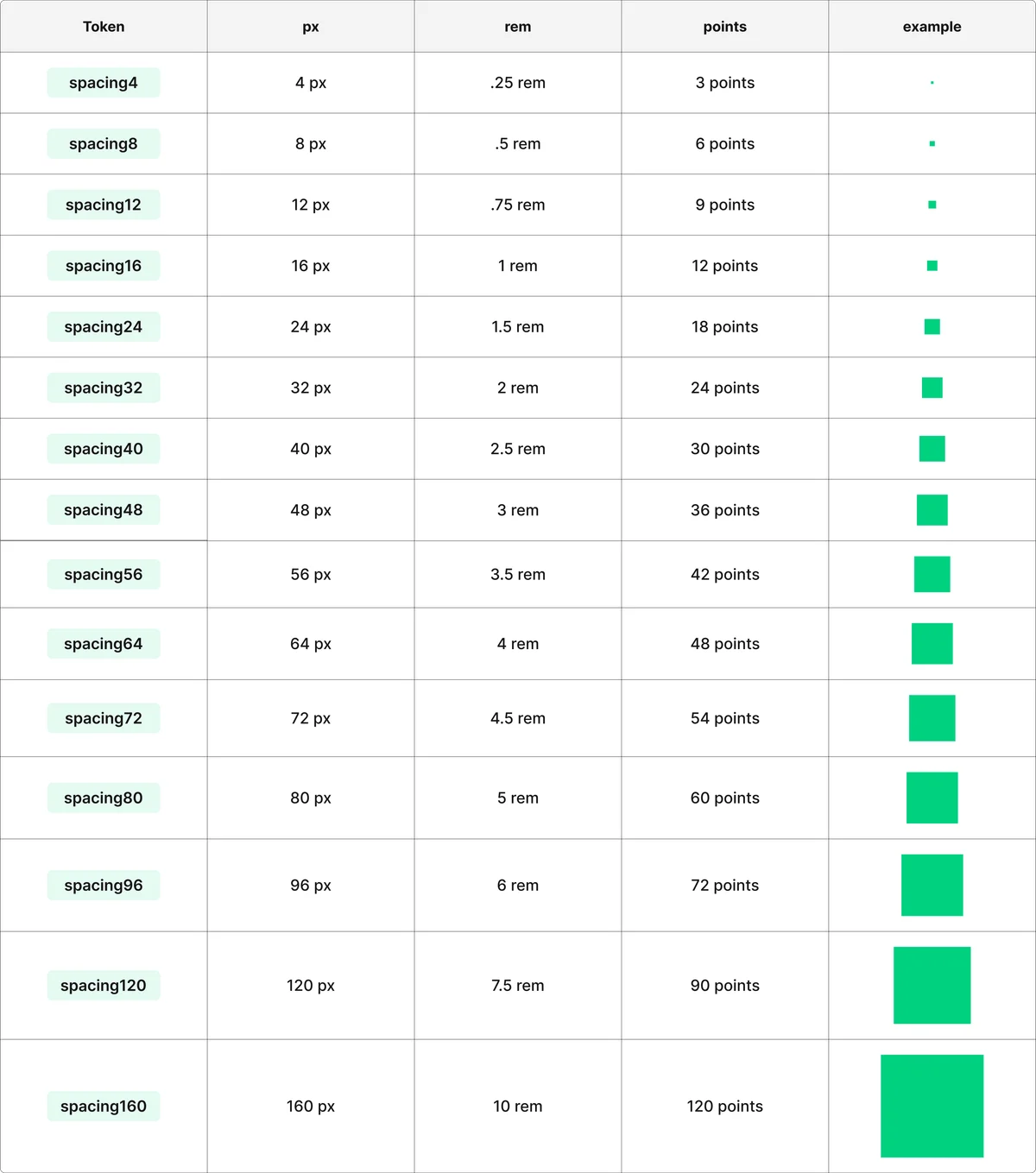
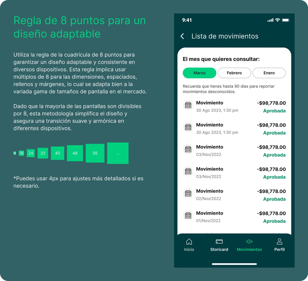
Spacing
A spacing scale built on multiples and divisors of 8, maintaining vertical and horizontal rhythm across every layout and component.
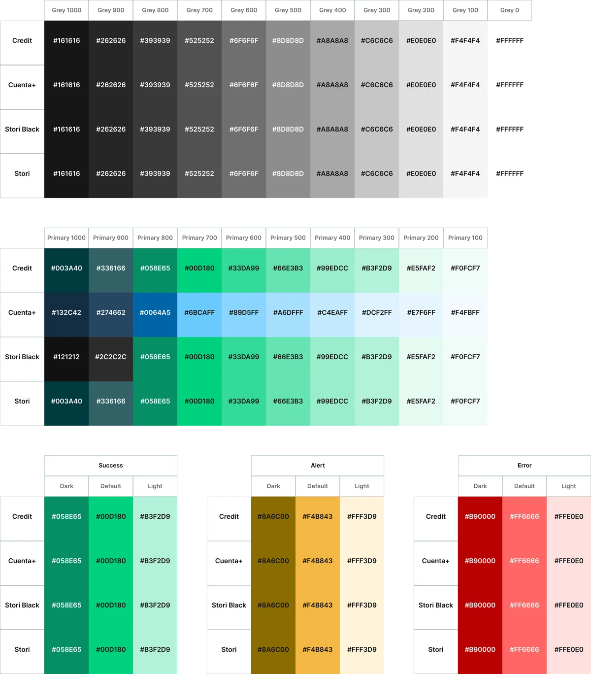
Color
Four product palettes — Credit, Cuenta+, Stori Black, and core Stori — each distributed across 5 scales: greys, primaries, success, alert, and error. Every color is tokenized for consistent application.
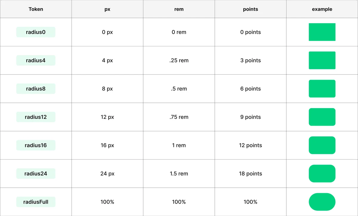
Corner radius
Seven radius values based on multiples and divisions of 8, creating a consistent rounding system from subtle chips to fully rounded buttons.
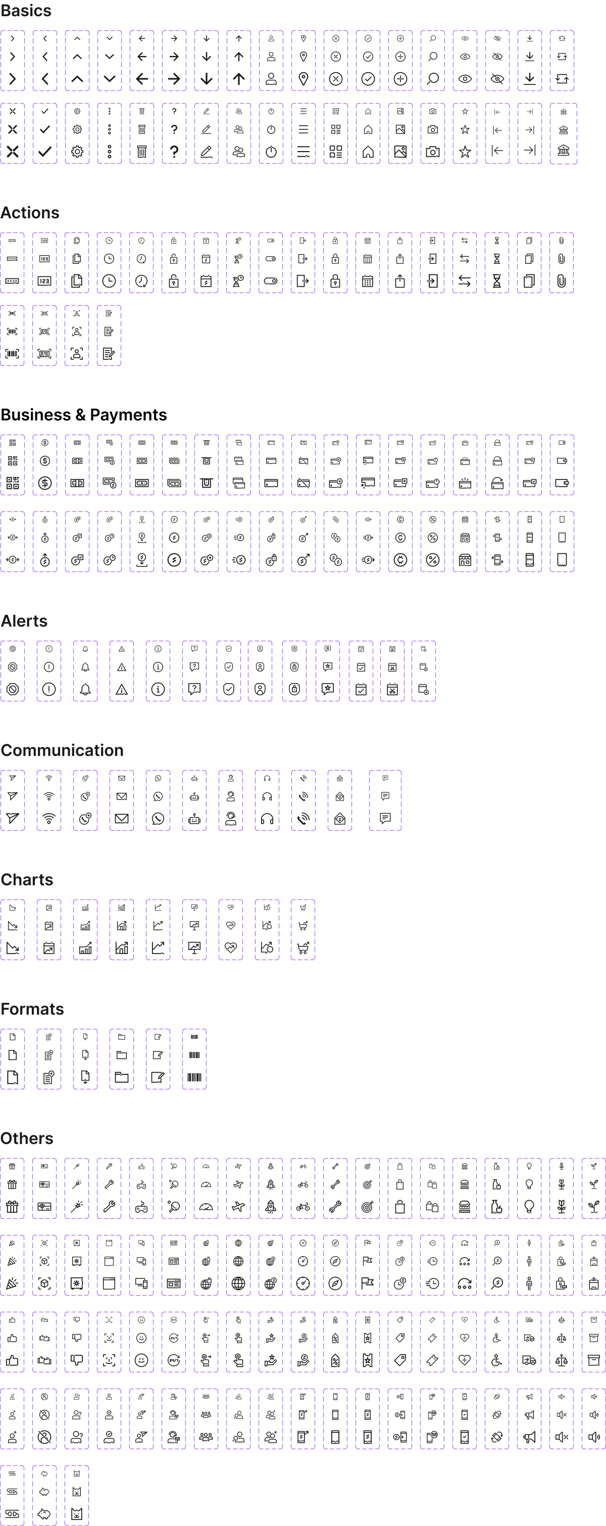
Icons
A distinctive icon set with a signature personality — subtle pixel offsets that give the iconography its own character. Covering navigation, actions, business, payments, alerts, communication, charts, formats, and more.
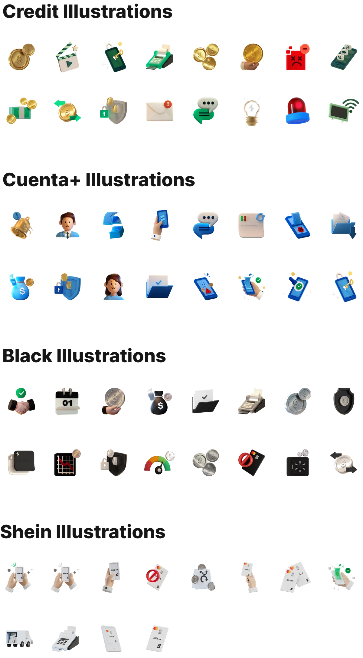
Illustrations
Product-oriented 3D illustrations for Credit, Cuenta+, Black, and partnerships like SHEIN. These maintain a consistent visual style that represents the Stori brand throughout the application.
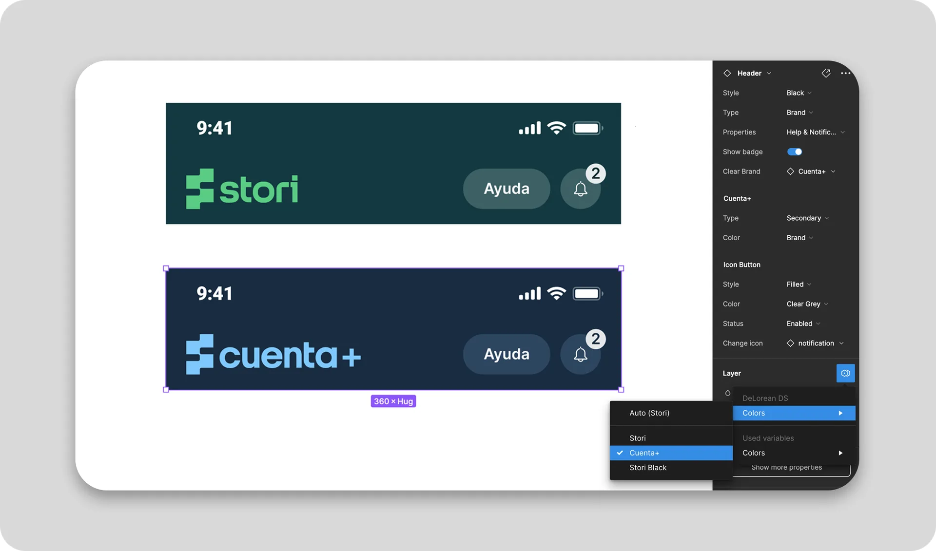
Multibrand theming
DeLorean was designed from the start to support the multiple brands living inside the Stori application — Stori as the overarching brand, alongside Stori Cuenta+ and Stori Black. We built the capability for the system to operate under different brand contexts, with components adapting through semantic tokens to respond to each brand globally, both in design and code.
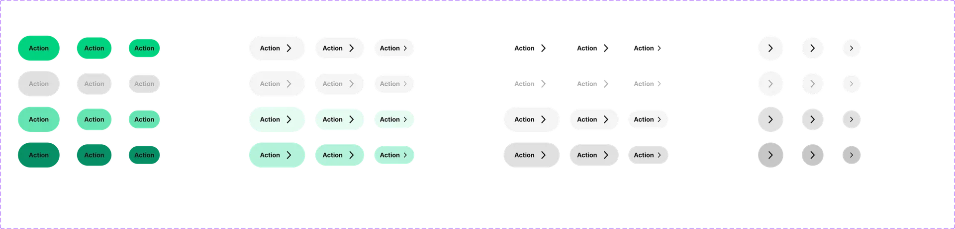
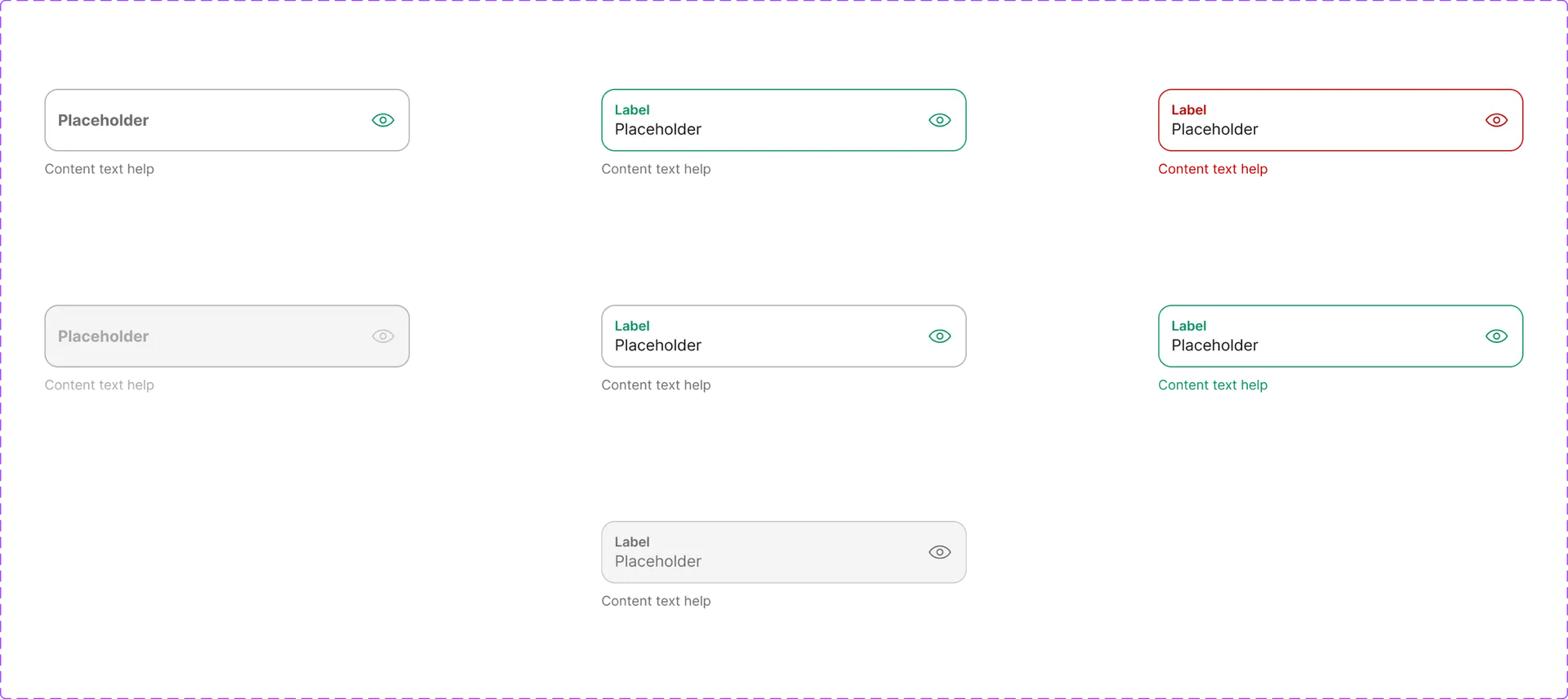
Component library
A comprehensive library of 100+ production-ready components designed for flexibility and consistency across iOS, Android, and Web. Every component supports theming through semantic tokens and ships with platform-specific documentation.
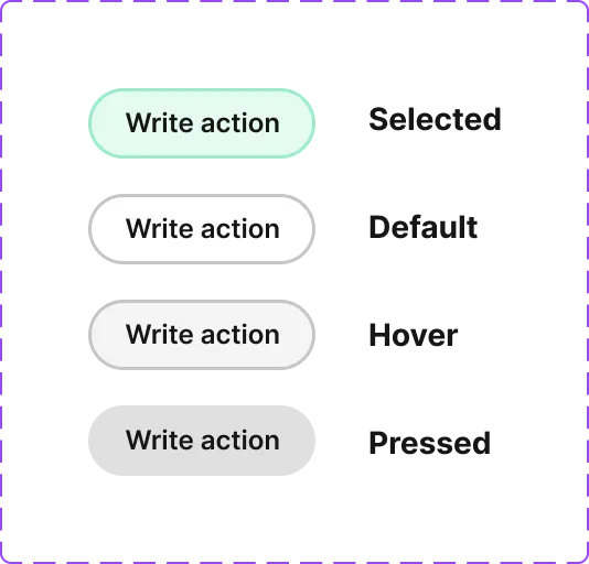
Buttons
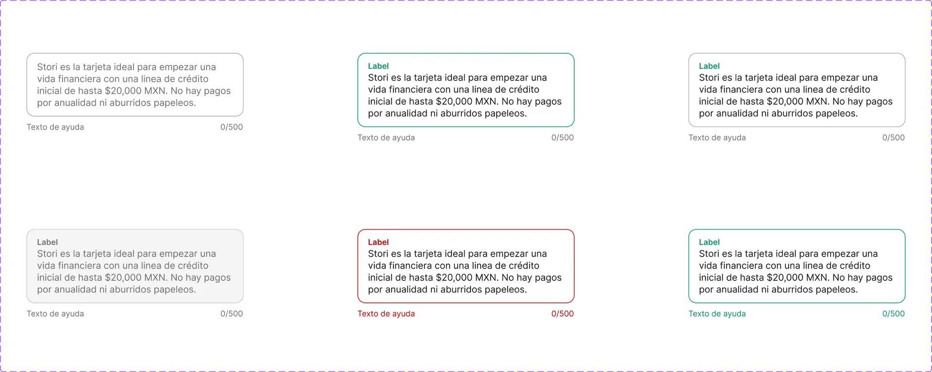
Text input
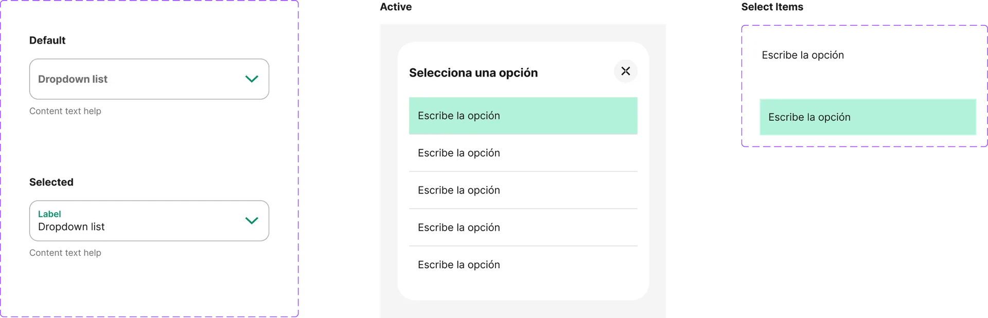
Select
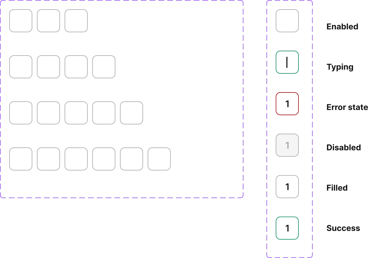
Code input
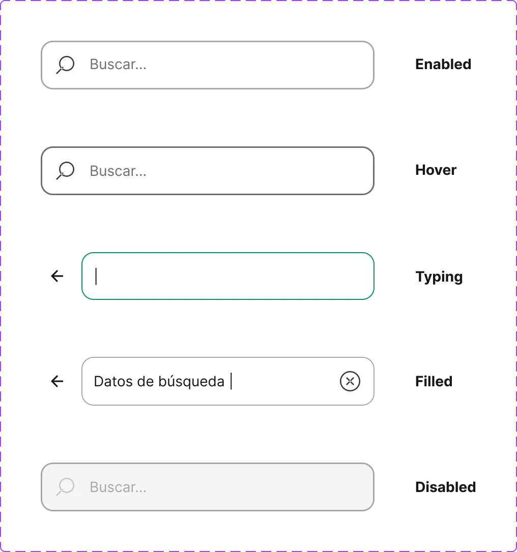
Search bar
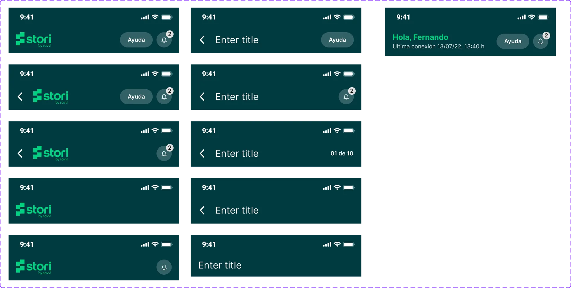
Header
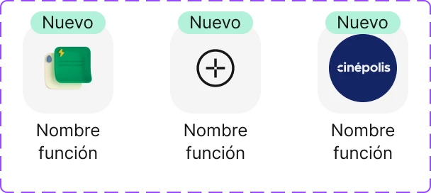
Quick action
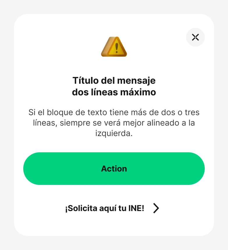
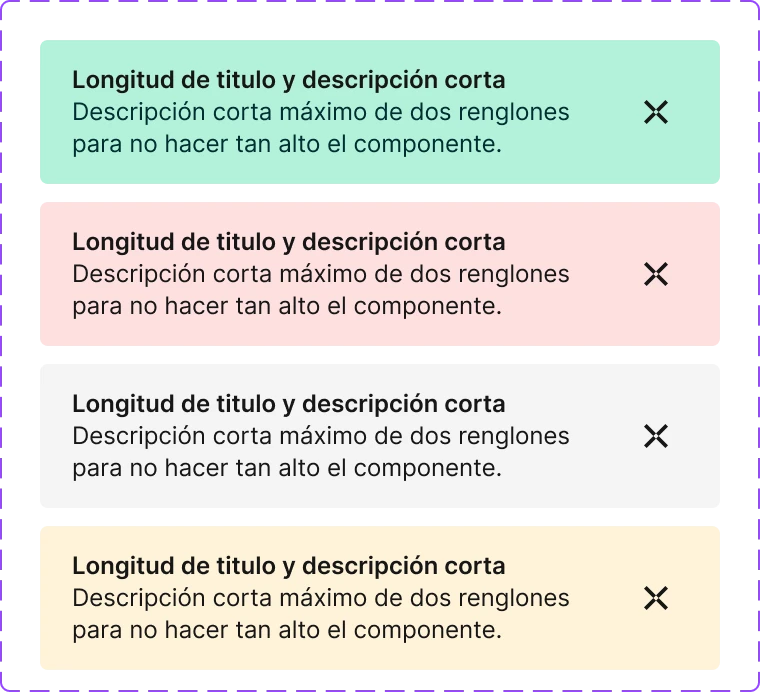
Banner
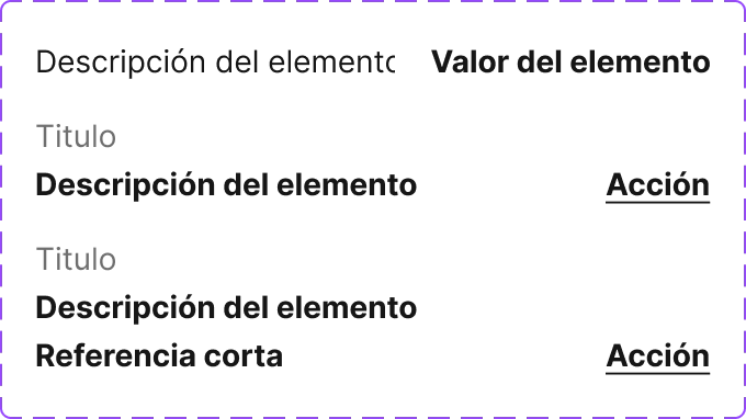
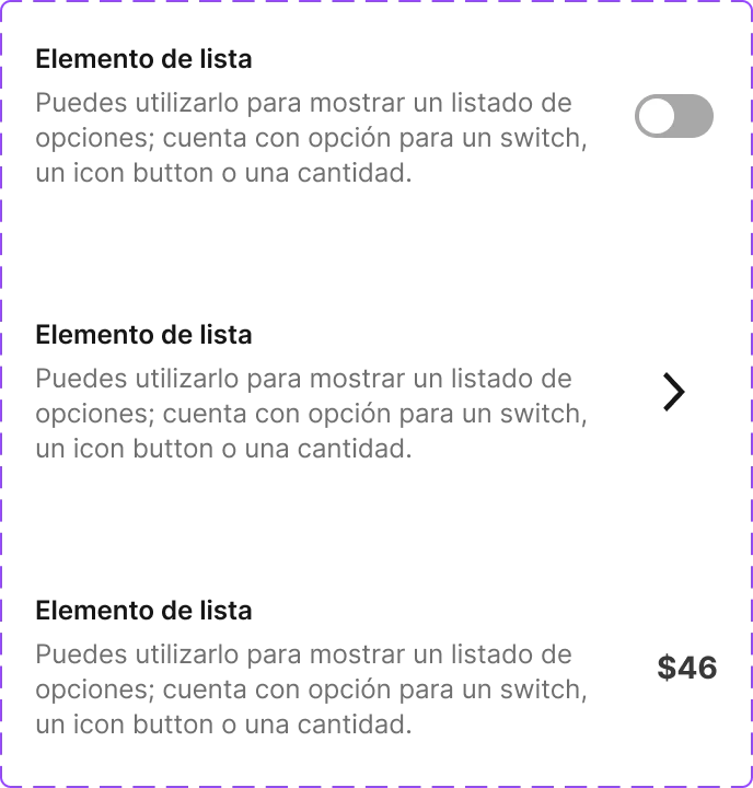
List element
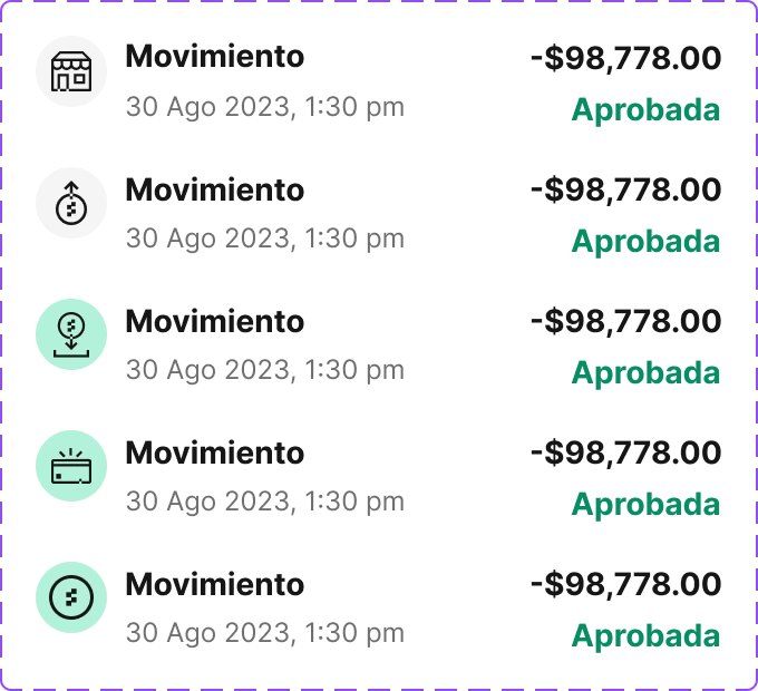
Movement
Tag
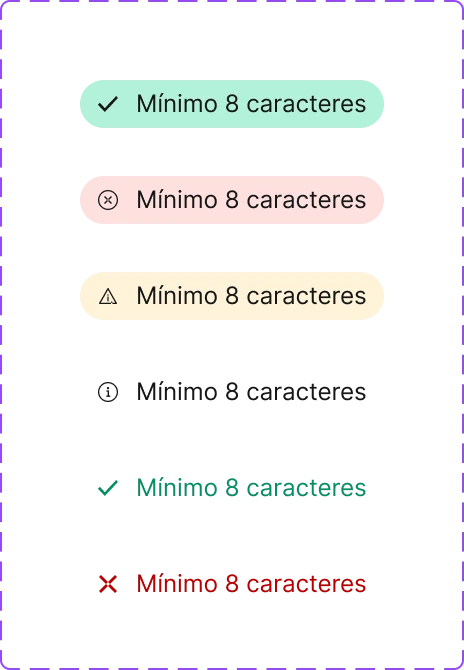
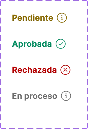
Status
Chips
Link button
Text area
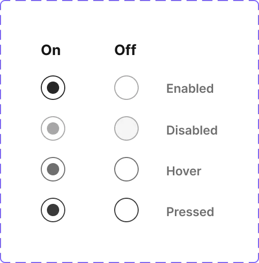
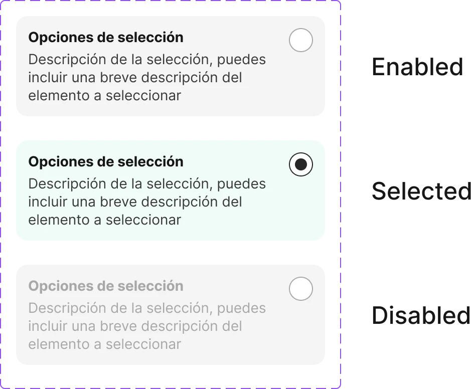
Radio button
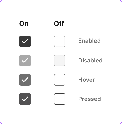
Checkbox
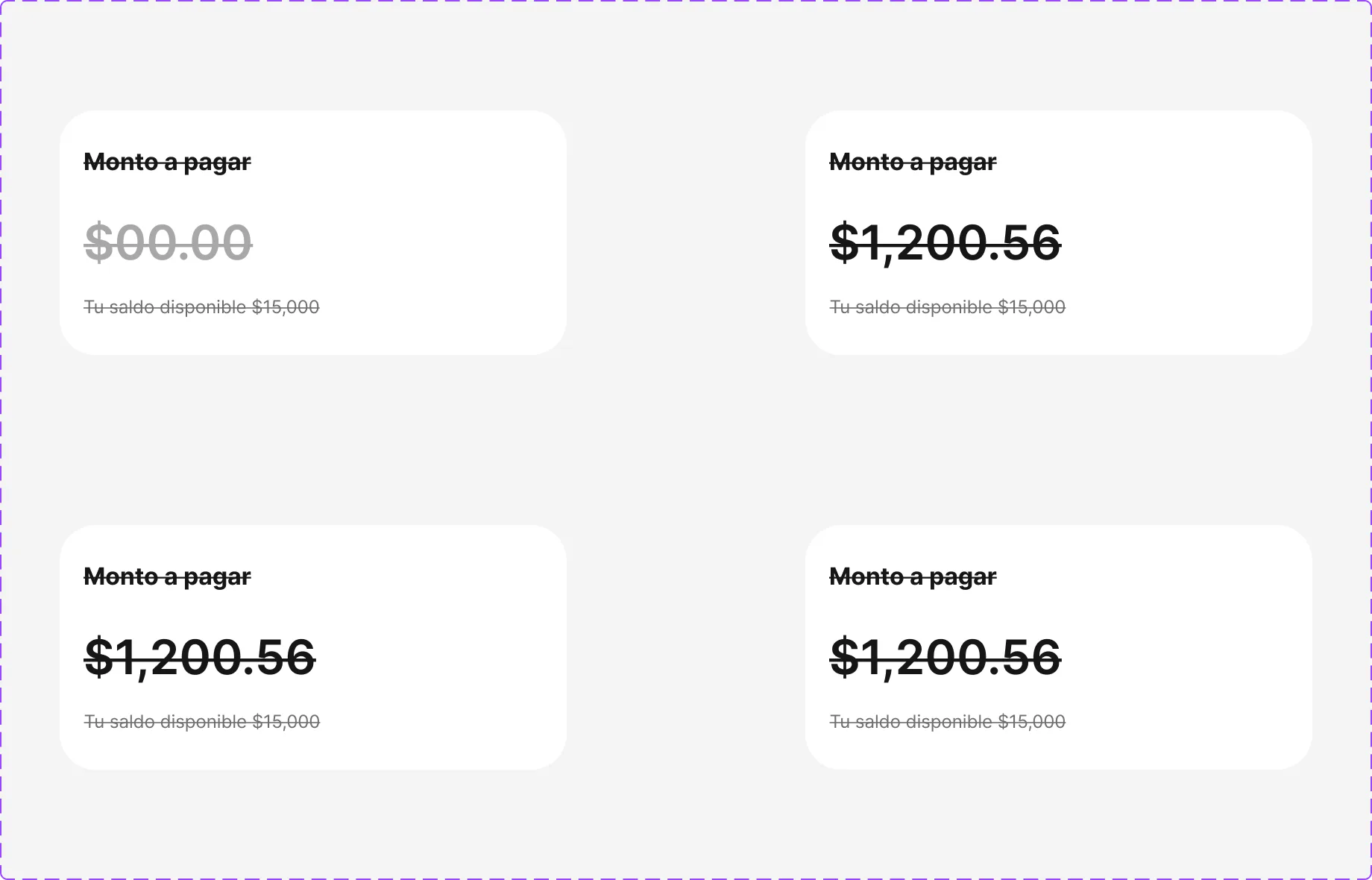
Amount input
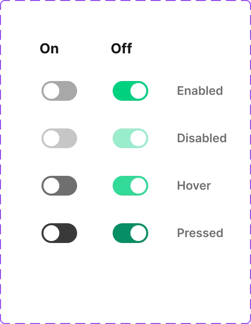
Switch
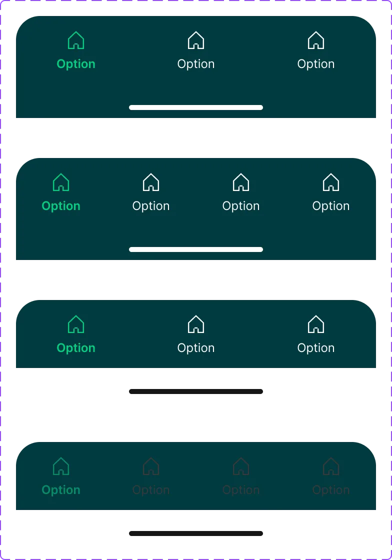
Navbar
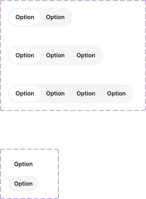
Segment control
Bottom sheet
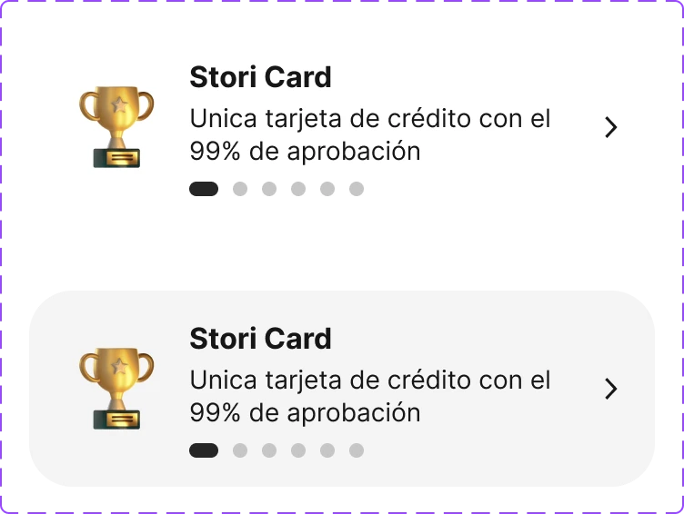
Selection card
Action list
Toast
Documentation
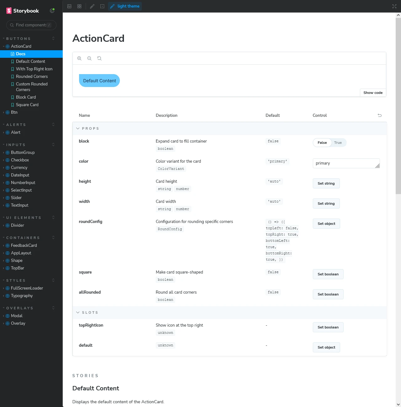
Each component ships with platform-specific documentation — Supernova served as the single source of truth, while Storybook powered the Web component playground. Documentation covered usage guidelines, props, variants, accessibility notes, and code examples for Android, iOS, and Web.
Adoption & governance
Adoption was driven through a structured governance model — contribution protocols, design reviews, and SDK distribution ensured every squad used DeLorean components consistently. The system achieved high adoption across all product squads, reducing design cycle time by 32%.